HereIn
Your India Growth Story
Opportunity
India has become one of the world's most attractive destinations for Global Capability Centres (GCCs) and multinational businesses. Yet entering and scaling in India remains complex. While the managed office sector is growing rapidly, most providers compete on space and commercial terms, with little differentiation beyond the office itself. Global enterprises need more than a workspace. They need a partner who understands India, helps navigate local complexities and supports long-term growth. The opportunity was to create a managed office brand that combined premium workspaces with local expertise, hospitality-led service and genuine partnership.
Solution
Ochre created a new managed office brand, backed by the Meenakshi Group, for multinational enterprises and Global Capability Centres expanding across India. Built around the idea "Your India Growth Partner," HereIn was positioned as more than a workspace provider. It combines premium managed workspaces, local expertise and hospitality-inspired service to help businesses establish, operate and grow with confidence. The result is a brand that feels professional, practical and progressive.
Result
The result is a differentiated managed office brand for the next generation of international businesses entering India. By moving beyond the traditional workspace category, HereIn creates a distinctive platform for growth in the expanding GCC sector. Designed to grow with its customers, the brand combines exceptional service with a modern identity that appeals to both global enterprises and top talent.
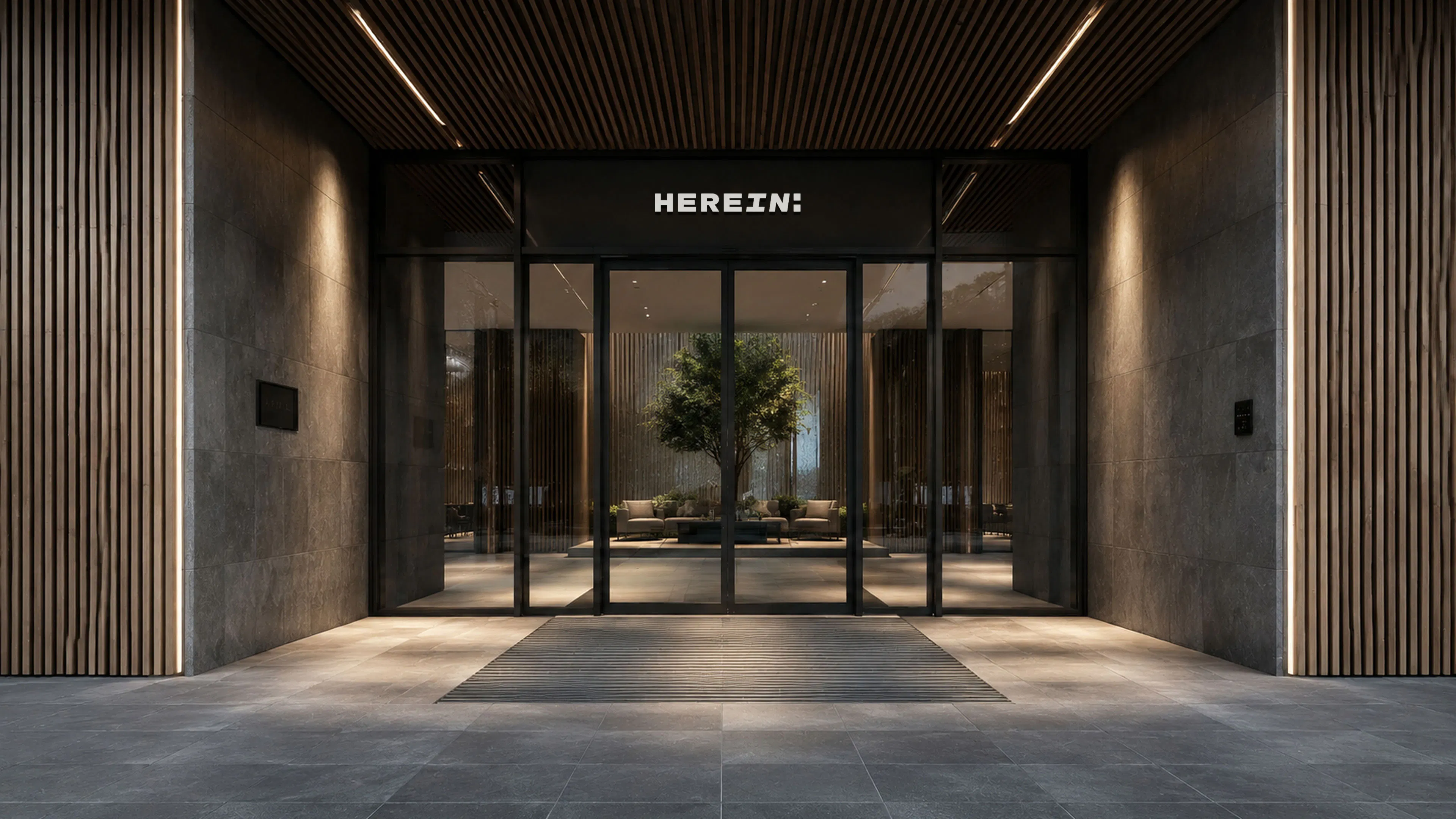
A Name Rooted in Place
The name HereIn reflects the brand's purpose of helping international businesses establish themselves here, in India, with confidence. Rather than focusing on office space, it focuses on place, presence and belonging. Simple, distinctive and globally accessible, HereIn communicates local relevance while supporting future growth across India and beyond.
A Detail That Connects
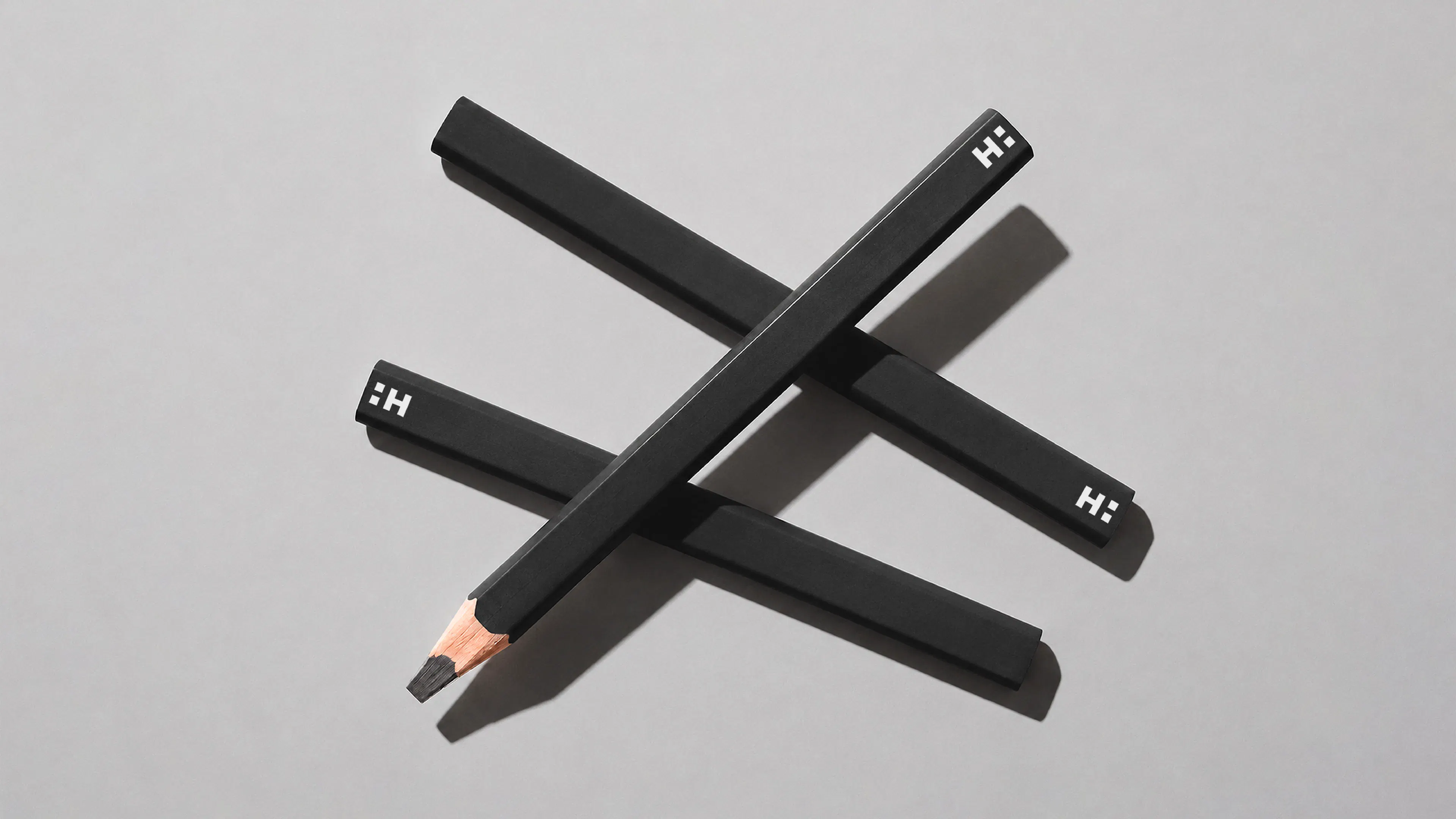
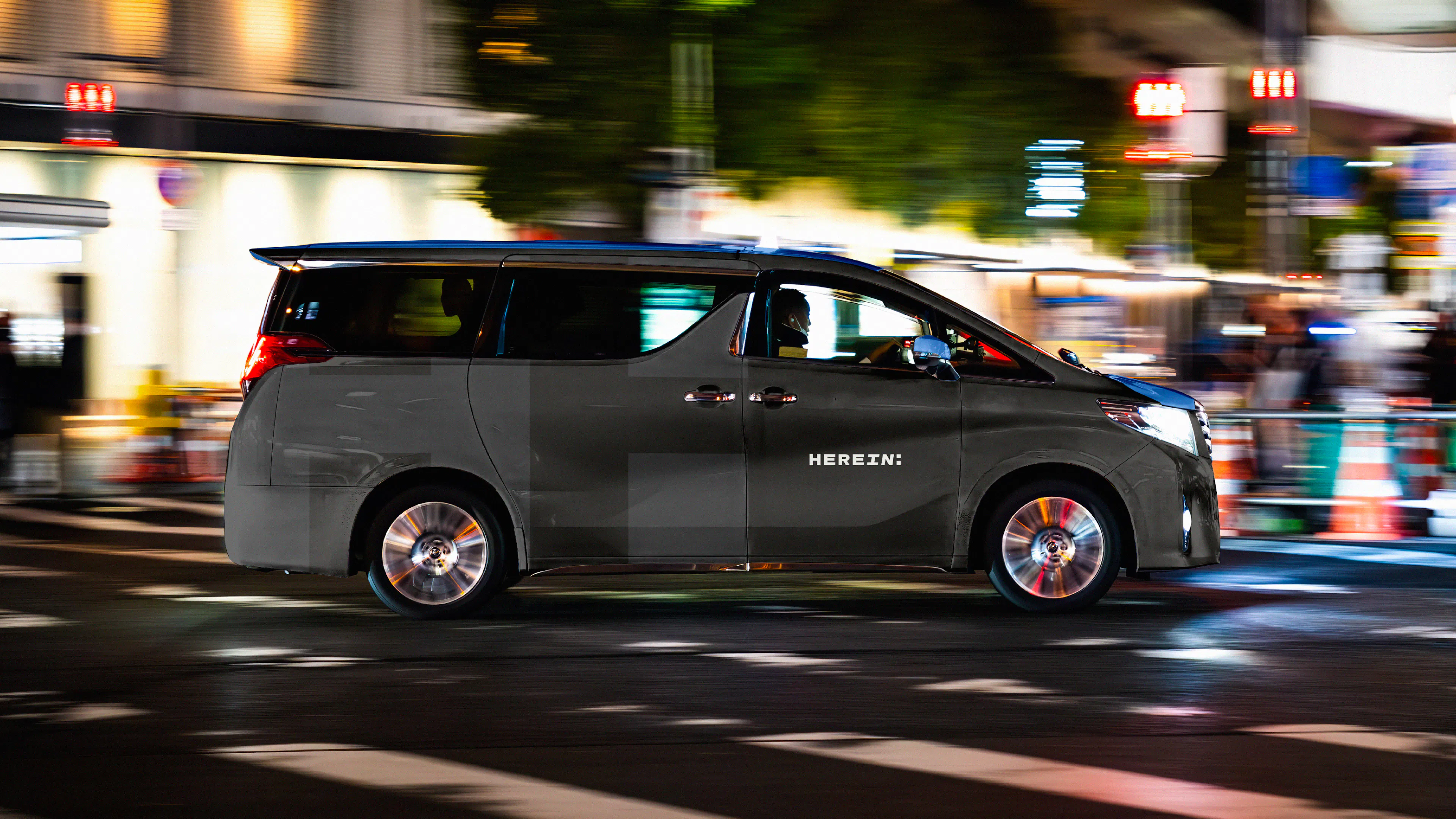
The colon is more than a punctuation mark in the HereIn logo. It gives the brandmark a distinctive finish, suggesting connection, continuation and what comes next. Within the logo system, it also creates a clear relationship between the master brand and specific locations, helping HereIn Hyderabad and other identifiers feel connected to one coherent brand.

From Punctuation to Personality
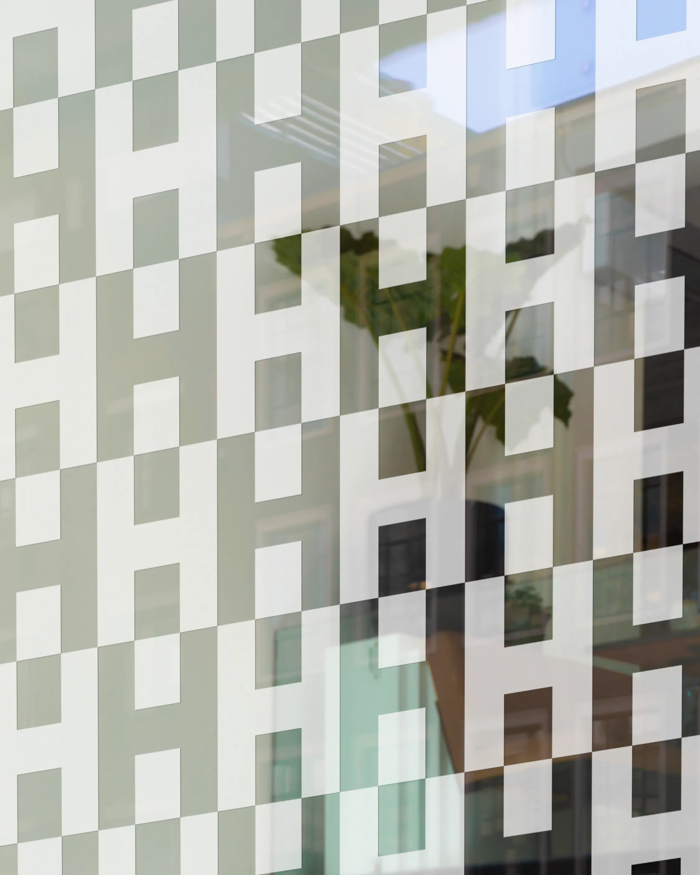
The colon became a core part of the HereIn visual language, extending a distinctive detail from the logo into a flexible graphic system. Built from two rounded squares, the device can hold imagery, messaging or the brandmark itself, creating structure across layouts while keeping a clear connection back to the identity. It gives the brand a simple, recognisable asset that reflects connection, continuation and the next stage of growth in India.
A More Human Layer
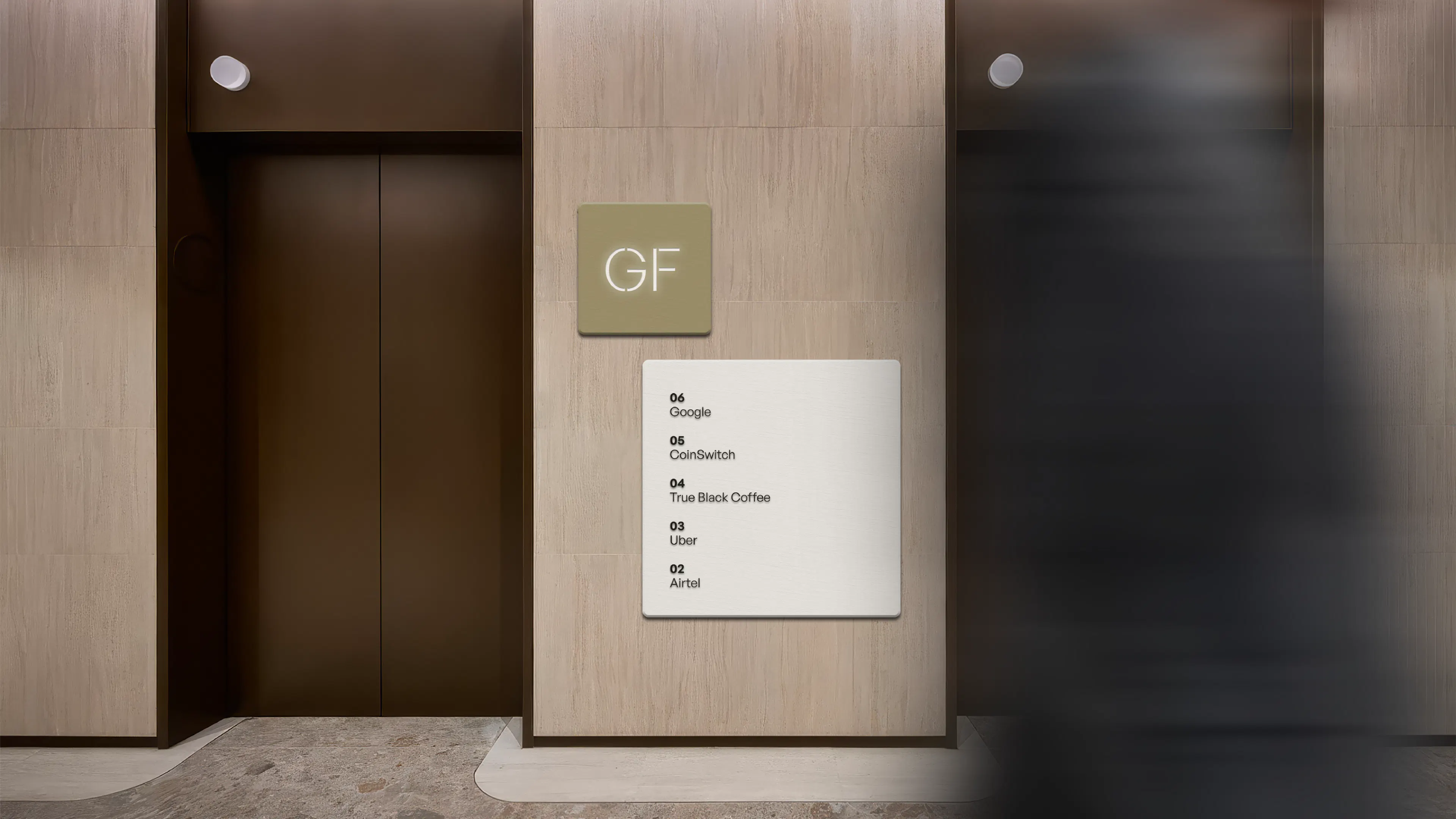
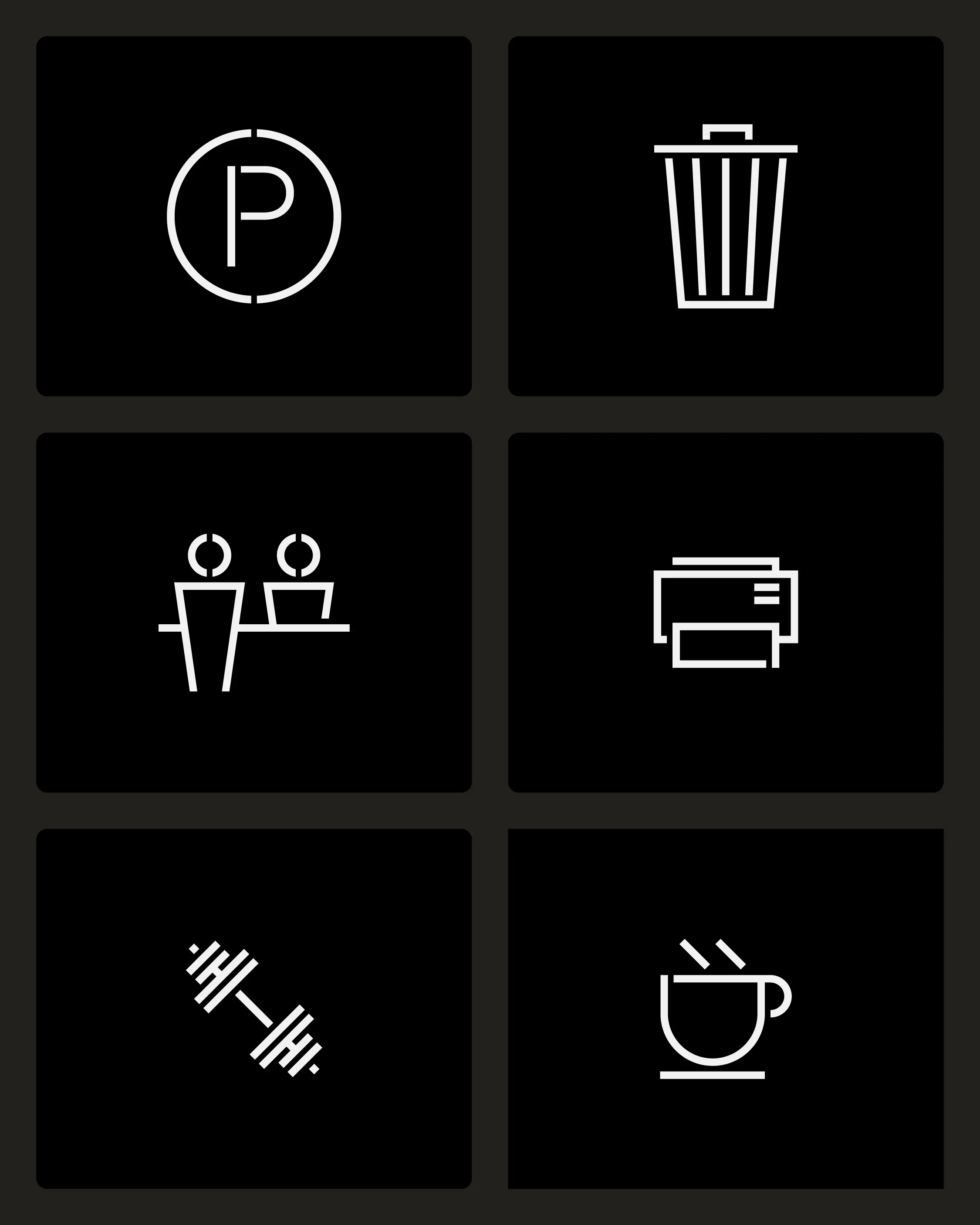
Illustration and iconography were introduced to make the HereIn identity feel more useful, human and easy to navigate. The illustration style adds warmth to functional communications, helping simplify workplace ideas without making them feel overly corporate. The icon system brings clarity to services, amenities and wayfinding, using a stencil-inspired visual language that connects back to the wider brand. Together, they give HereIn a practical set of tools for explaining, guiding and adding character across digital, print and physical touchpoints.
Conceptual illustrations by Artur Zherdetskii

The Wider Visual System
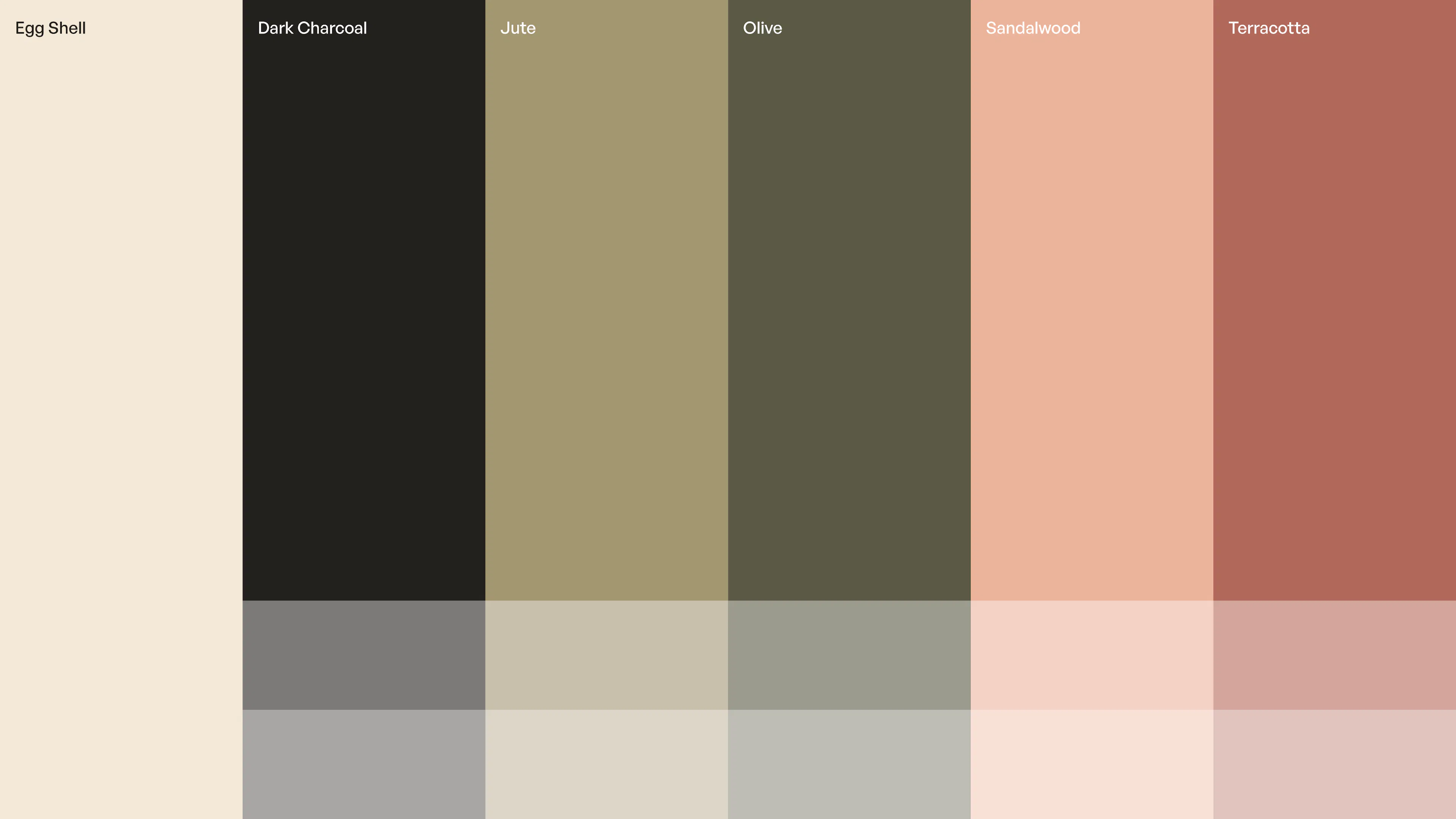
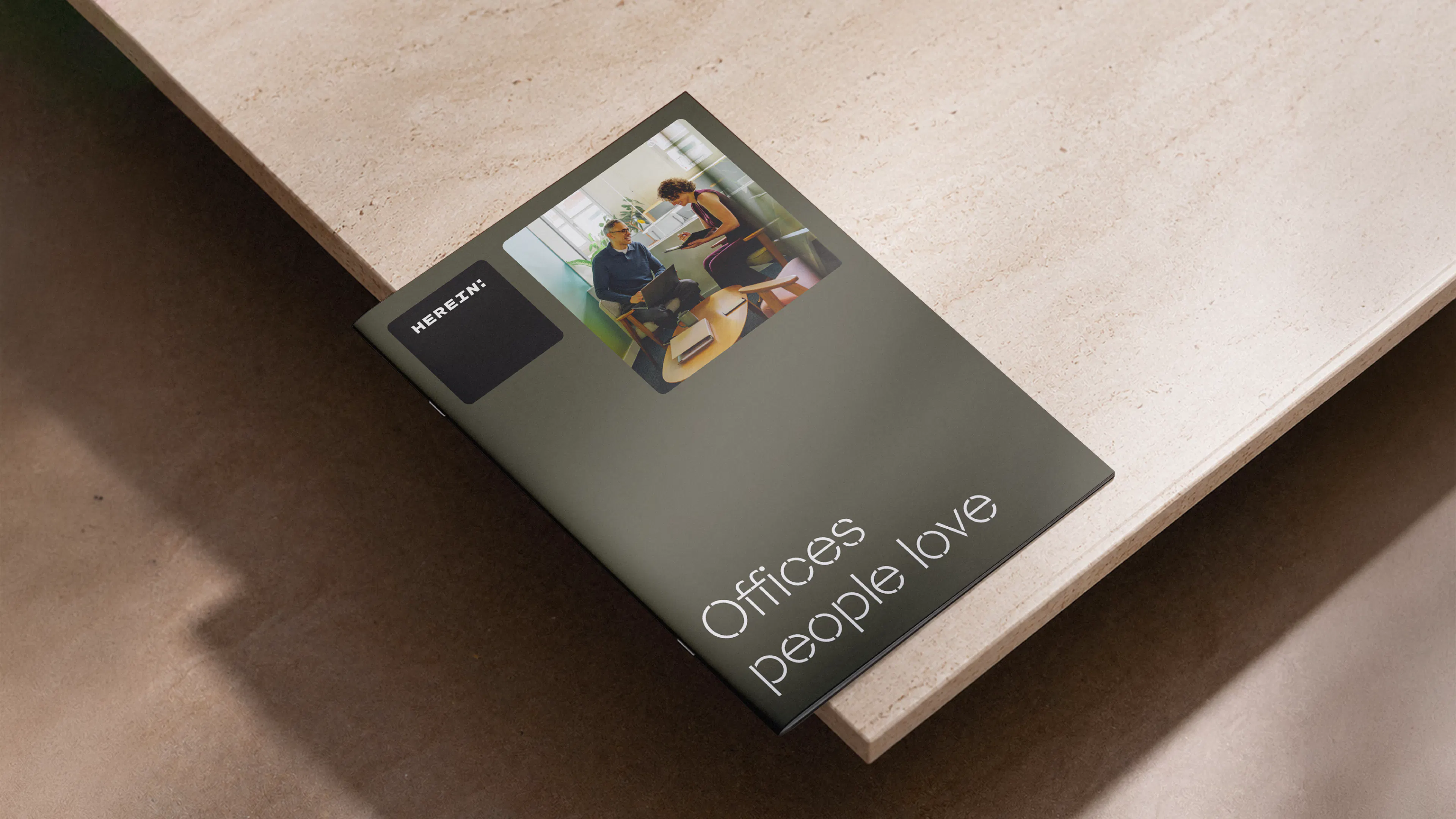
Beyond the logo, the HereIn identity is supported by a wider set of brand assets designed to create clarity, warmth and consistency. A material-led colour palette gives the brand a grounded, contemporary feel, while the typography adds a more distinctive architectural quality. Its structured forms and stencil-like details suggest flexibility, modularity and spaces that can be shaped around different needs. Imagery brings the offer to life, showing real workplaces, considered details and future spaces in a way that feels tangible, professional and human.